Every so often I will get the chance to cook up some code for one of the usual software scope control packages. But these days, I spend most of my time in programs like Fusion360, Fritzing, and the like. So I guess this is how I feel when using the typical scope control software. How about you?
I’ve used Elements, imagePro, MetaMorph, for years. It’s all good software. It’s powerful, and can do all sorts of crazy things that are super awesome. But what if I just want to obtain a 3 channel fluorescent image? Here’s what I end up looking at for a simple capture.

But this must be only one program, right? Surely other more capable systems have a current style of user interface, right? Here’s an example of the most capable (and IMHO fastest) software around, the venerable MetaMorph.

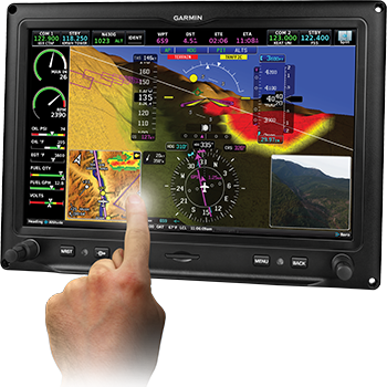
For the typical person who just wants to snap an image, this is overkill. Now – I don’t intend to bash on these great software applications. For multi-dimensional timelapse, or other advanced work, there are few better tools available, and these do a great job of providing any feature one could want. But what percentage of labs have such complicated instruments, vs. the great number of simple, multichannel fluorescent  microscopes around in every biology facility? How can it be that all these users must learn these behemoth software packages to capture some cultures? Other industries seem to have moved to workflow-based designs. You can find apps that perform full MIDI mixing on a tablet, heck, even airplanes have touchscreen controls now! Yet the microscopy industry seems to be locked into a slightly improved version of windows XP button mashup.
With all of the consumer products finding ways of simplifying control over hardware, isn’t there another way of doing this?
Good software design can perform a specified job, and provide users the controls they need to do that job, but excellent software does so without requiring any training. An example of this can be found below, showing a unified interface for shuttering, attenuation and capture. This is a very limited example of what’s coming up, but just from this clip I think the differences in design philosophy are evident.

I think Scotty wasn’t annoyed at the keyboard because he had to use it. He was annoyed because of what it represented: A barrier to getting his work done. Microscope time isn’t free time. There’s a lot of other, far more important work to be done than collecting the results of actual research. Cumbersome software results in less time to do the important stuff.
Complex software will always be required for highly complex jobs, but for everyone else, I’m happy to say that the days of “software training” will soon be behind us. My guess is that most people will have a hard time going back to click and hunt, after using the next generation of control software. I know my perspective has changed. I guess that’s why these days, when I sit down behind a button-crowded screen, all I can think of is Scotty cracking his fingers 🙂
-Austin